TECOTEC BRANDING
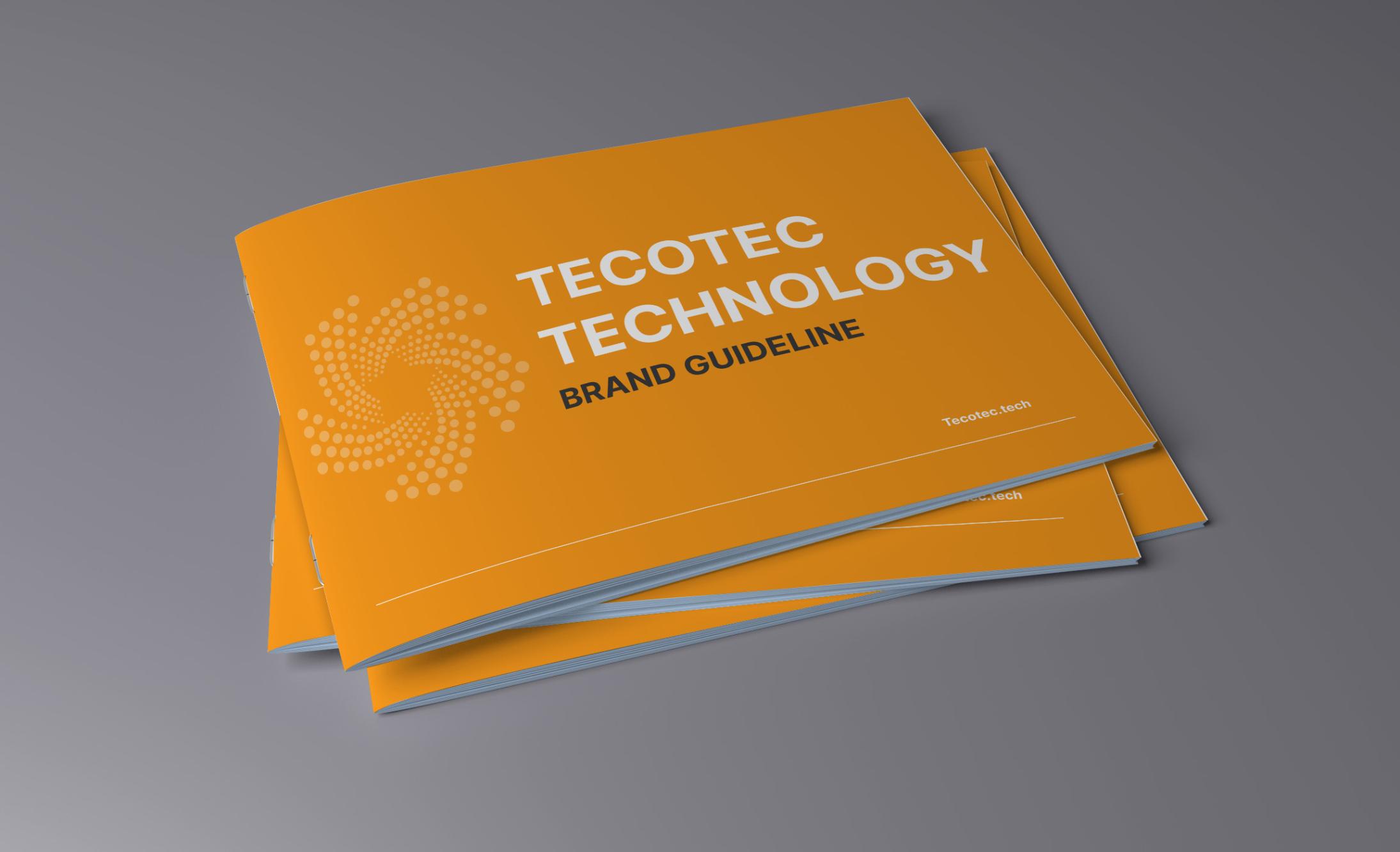
PROJECT OVERVIEW
Re-design logo
Brand guideline
UI Website
As TECOTEC continued to expand its capabilities across engineering, technology, and industrial solutions, its brand identity no longer reflected the company's expertise, scale, and long-term vision.
The challenge was to create a cohesive brand system and redesign their website UI that could unify a diverse range of services, strengthen market credibility.
The new identity needed to communicate technical excellence while remaining flexible enough to support multiple touchpoints, including digital platforms, marketing materials, and corporate communications.
BRAND GUIDELINE

Logo usage
The TECOTEC logo is the primary visual identifier of the brand. Consistent use of the logo helps maintain a strong, recognizable, and professional brand identity across all touchpoints.
Category
Logo minimum size
Logo variations
Co-branding rules
Background color
b. Typography
We selected Inter as the primary typeface for the brand due to its exceptional readability, versatility, and modern character.
INTER
CHALLENGING, HIGH-IMPACT WORK
AT T3, OUR WORK IS CHALLENGING AND HIGH IMPACT.
As a team, our mission is to bring excellence in both design and manufacturing. Recognizing that quality holds varied
meanings for different customers, we are dedicated to committing and collaborating to design and implement the optimal solution.
ABC12
ABC12
ABC12
ABC12
ABC12
ABC12
ABC12
ABC12
ABC12
ABC12
ABC12
ABC12
ABC12
ABC12
ABC12
ABC12
c. Color Palette
The brand color palette is designed to create a consistent and recognizable visual identity across all brand touchpoints.
Primary color palette
Secondary color palette
Accent color palette

